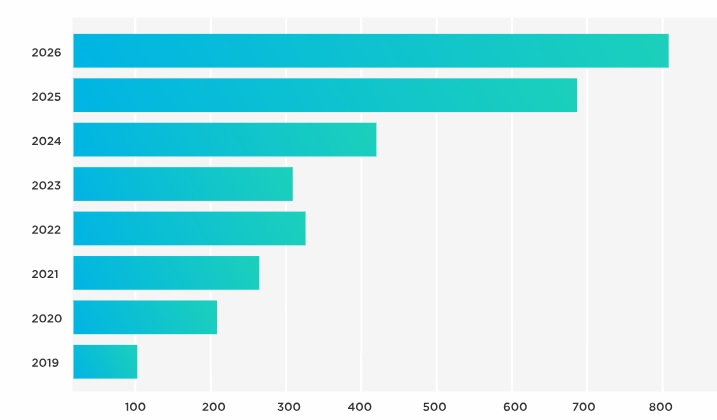
Regardless of which field you’re in, visual data representation plays a critical role in efficiently analyzing and interpreting information. Among the many types of visuals, bar charts stand at the forefront due to their simplicity and effectiveness. In this article, apart from focusing on traditional methods, we will explore advanced techniques for enhancing bar charts, including the incorporation of animations and interactive features.
Taking Advantage of Animation to Boost Chart Impact
The incorporation of animations can bring a sense of dynamism and life to your bar charts. Animations can make it easier for viewers to digest the information presented.
Animation in bar charts allows for the smooth transition of data from one stage to another. This proves especially useful when showing time-series data or changes in information over some time.
But remember, the use of animations should not be excessive. Subtle movements that guide the viewer’s eyes to important elements are often enough to grab their attention without overwhelming them.
The Art of Interactive Features for an Engaging Bar Chart
Interactive features in bar charts can notably increase user engagement and understanding. They introduce a level of user manipulation that traditional static charts don’t offer.
Elements like tooltips, clickable bars, and drill-down features allow users to explore different levels of data details. These elements increase user engagement, making them pivotal for creating in-depth data exploration tools.
Furthermore, the dynamic nature of interactions ensures that the user remains engaged with the information for longer, leading to a deeper understanding. Interactive features should always align with the user’s needs, and never complicate the visual experience.
Having discussed animations and interactive features, let’s look at the steps to apply these advanced techniques.
Advanced Techniques in Enhancing Bar Chart Visuals

Alt Text: A data analyst going over bar charts.
Enhancing bar charts with advanced techniques begins with understanding the data and the message it conveys. From there, you consider adding animated features that make sense in the context of your data and your audience. Thus, you need to be aware of your audience’s familiarity with animations and their potential reactions.
Interactive features, on the other hand, require a deep understanding of the user’s needs. One should design features that add value to the user’s experience, like extra details on demand without bombarding the user with information.
Testing is a critical step in refining these enhanced charts. It helps you understand if your audience interacts with your visuals in the intended way and provides insights for improvement.
The appropriate mix of animations and interactive features can significantly improve the user’s experience and understanding of the data.
The Potential of Bar Charts as Visual Data Narratives
Bar charts, with their simplicity, play an instrumental role in communicating data narratives effectively. When you further enhance them with advanced techniques, they become compelling tools for delivering clear and concise visual data narratives.
Animation can transform time-series data into a captivating visual story. At the same time, interactive features can turn your bar chart into an interactive data exploration tool, promoting a deeper understanding of the data.
Advanced bar charts are not just a mix of awesome techniques; they are intelligent visual aids that bridge the gap between data and decision-making.
Indeed, with the right understanding and execution, the potential of bar charts in visual data representation is limitless. Enhancing bar charts with animation and interactive features brings a new dimension to visual data narratives. When executed correctly, these advanced techniques can significantly improve comprehension, engagement, and user experience.
